Chrysalis Mag
Chrysalis Mag
Chrysalis Mag
Chrysalis Mag
Content platform
Content platform
Content platform
Case study | 2020 – present
Building the design infrastructure of a multilingual contemporary-art platform – brand, UX/UI, and a design system that has let editors publish daily for six years without a designer in the loop.
Building the design infrastructure of a multilingual contemporary-art platform – brand, UX/UI, and a design system that has let editors publish daily for six years without a designer in the loop.
Building the design infrastructure of a multilingual contemporary-art platform – brand, UX/UI, and a design system that has let editors publish daily for six years without a designer in the loop.
Building the design infrastructure of a multilingual contemporary-art platform – brand, UX/UI, and a design system that has let editors publish daily for six years without a designer in the loop.
Role
Principal Design Owner
(sole designer)
Role
Principal Design Owner
(sole designer)
Role
Principal Design Owner
(sole designer)
Scope
Brand · UX/UI · Design system · Special projects
Scope
Brand · UX/UI · Design system · Special projects
Team
Front-end engineers, editors, marketing, management
Team
Front-end engineers, editors, marketing, management
Team
Front-end engineers, editors, marketing, management
Timeline
2020 – present
6+ years live
Timeline
2020 – present
6+ years live
Stack
Figma · WordPress / Semplice + custom modules
Stack
Figma · WordPress / Semplice + custom modules
Stack
Figma · WordPress / Semplice + custom modules
AI-Assisted Tools
Adobe Firefly · Claude Code
AI-Assisted Tools
Adobe Firefly · Claude Code
The live platform. Chrysalis Mag is a contemporary-art media platform covering Belarusian and Eastern-European art: longform essays, visual features, an A–Z artist archive, and special digital projects, published in Belarusian and English.
01. Context & Challenge
01. Context & Challenge
Ambitious content. No design infrastructure
Ambitious content.
No design infrastructure
Chrysalis Mag launched in 2018 as an independent magazine on Belarusian contemporary art. By 2020 it had ambitious, art-directed content and a growing team – but no design foundation: no consistent identity, no templates, no system a non-designer could use. Longreads were laid out by hand, image-heavy features broke on mobile, and the artist archive couldn't grow without fresh design work each time. I joined as sole designer to fix this structurally, and have been principal design owner for the six years since.
Chrysalis Mag launched in 2018 as an independent magazine about Belarusian contemporary art. By 2020 it had ambitious, art-directed content and a growing editorial team – but no design foundation to carry it.
There was no consistent identity, no publishing templates, and no system a non-designer could publish with. Every longread was laid out by hand. Imagery-heavy features broke on mobile. The artist archive couldn’t grow without design work each time.
I joined as the platform’s single designer with a mandate to fix this structurally – and stayed as its principal design owner for the six years since.
Problem 01 – Inconsistency
No identity system or layout rules: every article looked different, and the magazine’s visual credibility depended on manual effort rather than infrastructure.
Problem 01 – Inconsistency
No identity system or layout rules: every article looked different, and the magazine’s visual credibility depended on manual effort rather than infrastructure.
Problem 02 – Editor dependency
Editors could not lay out longreads without a designer. Design was the bottleneck between finished writing and publication.
Problem 02 — Editor dependency
Editors could not lay out longreads without a designer. Design was the bottleneck between finished writing and publication.
Problem 02 – Editor dependency
Editors could not lay out longreads without a designer. Design was the bottleneck between finished writing and publication.
Problem 03 – Fragile responsiveness
Image-driven visual essays – the heart of an art magazine – broke on tablet and mobile, where most of the audience actually reads.
Problem 03 — Fragile responsiveness
Image-driven visual essays — the heart of an art magazine — broke on tablet and mobile, where most of the audience actually reads.
Problem 03 – Fragile responsiveness
Image-driven visual essays – the heart of an art magazine – broke on tablet and mobile, where most of the audience actually reads.
Problem 04 – Ungrowable archive
The A–Z artist archive, the platform’s long-term value, required new design work for every entry – so it barely grew.
Problem 04 – Ungrowable archive
The A–Z artist archive, the platform’s long-term value, required new design work for every entry – so it barely grew.
Problem 04 – Ungrowable archive
The A–Z artist archive, the platform’s long-term value, required new design work for every entry – so it barely grew.
02. Role & Ownership
02. Role & Ownership
Principal design owner, end to end
Principal design owner,
end to end
I was the single designer responsible for every design decision on the platform, working cross-functionally with front-end engineers, editors, marketing, and management.
I was the single designer responsible for every design decision on the platform, working cross-functionally with front-end engineers, editors, marketing, and management.
Brand identity
Logo, typography system, color, and an overall visual language that holds both restrained editorial pages and loud contemporary artwork – without competing with it.
Heard from engineers
“Give us repeatable modules, not one-off art pages. If it’s a component, we can build it once and reuse it.”
UX / UI
Information architecture, user flows, wireframes, clickable prototypes, and high-fidelity screens across desktop, tablet, and mobile.
Heard from engineers
“Give us repeatable modules, not one-off art pages. If it’s a component, we can build it once and reuse it.”
Launch & iteration
Engineering handoff, build reviews, design QA on staging, and six years of post-launch evolution: motion patterns, new formats, and special projects.
Heard from engineers
“Give us repeatable modules, not one-off art pages. If it’s a component, we can build it once and reuse it.”
Knowledge sharing
System documentation the team can self-serve from, plus retrospectives after each special project on what the platform should absorb from it.
Heard from engineers
“Give us repeatable modules, not one-off art pages. If it’s a component, we can build it once and reuse it.”
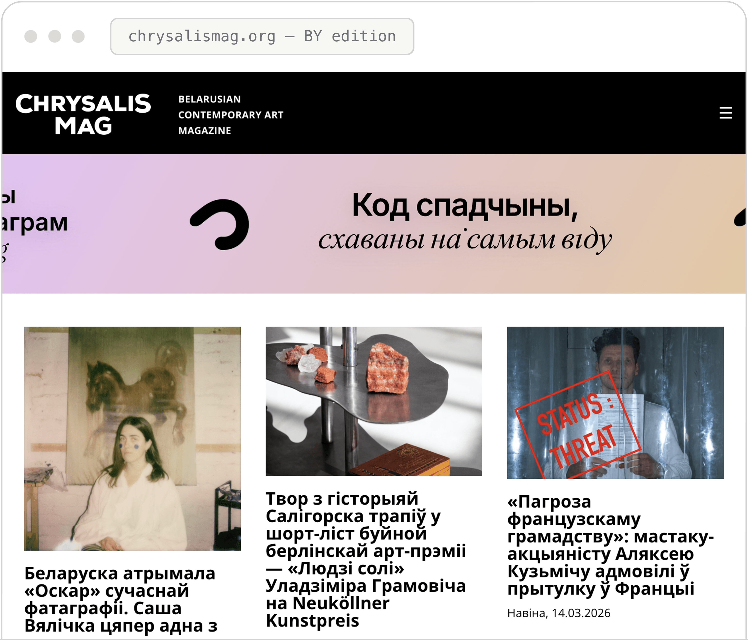
Shipped hi-fi: the same structure, carried through to production.
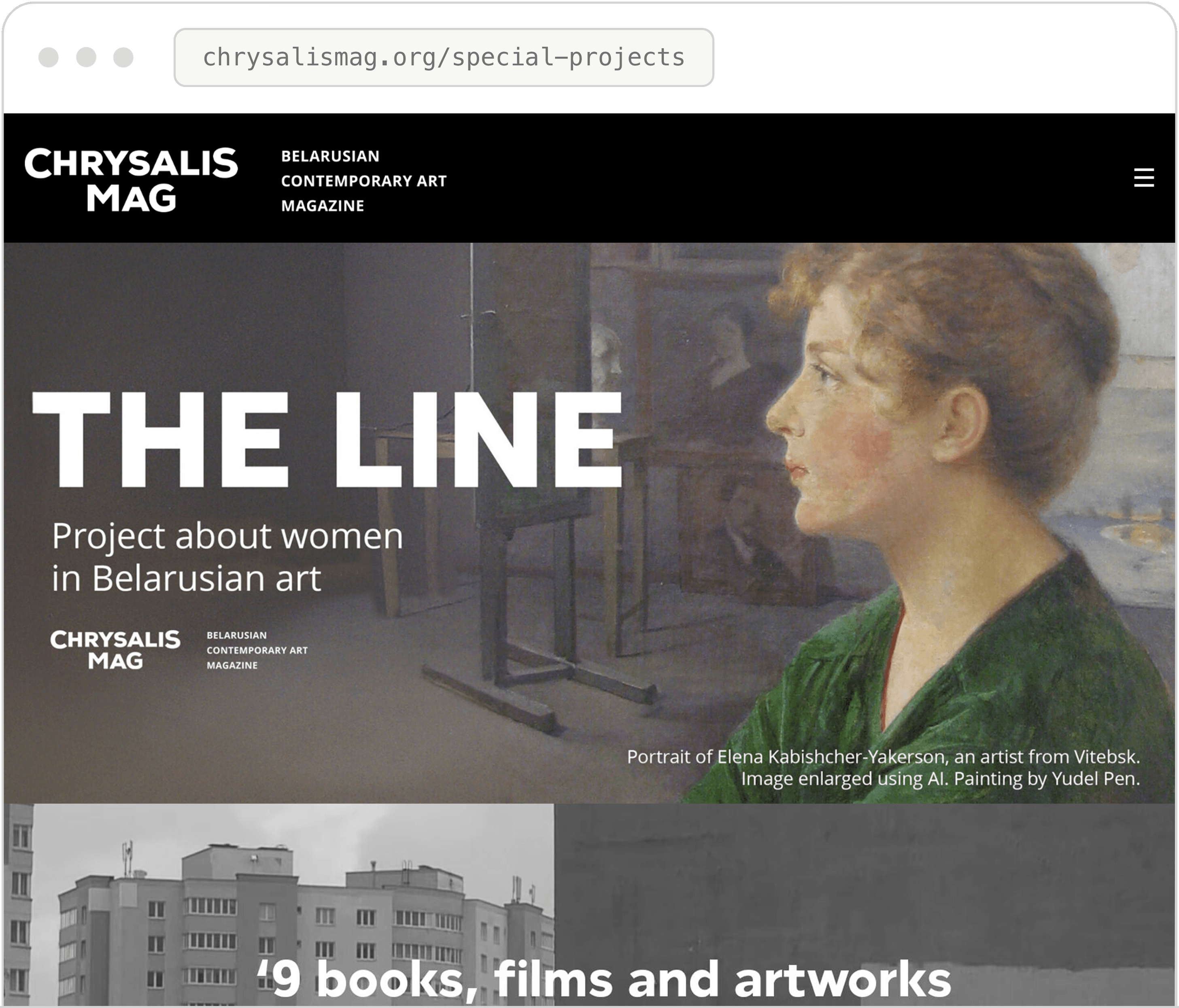
Special-project cover art living inside the system’s frame: loud artwork, quiet chrome.
03. Process
03. Process
From workshops to a living system
From workshops to a living system

Process overview. Linear to launch, cyclical ever since: each new format or special project returns learnings to the design system.
Discovery: workshops, not assumptions
Discovery: workshops, not assumptions
Discovery: workshops, not assumptions
Discovery: workshops, not assumptions
I ran working sessions with editors, engineers, and marketing to map where publishing actually hurt. The output wasn’t a mood board – it was a prioritized list of design problems, each tied to a person who felt it weekly.
Those sessions set the project’s hierarchy of needs: templates before aesthetics, archive scalability before new formats, mobile reading before desktop polish.
I ran working sessions with editors, engineers, and marketing to map where publishing actually hurt. The output wasn’t a mood board – it was a prioritized list of design problems, each tied to a person who felt it weekly.
Those sessions set the project’s hierarchy of needs: templates before aesthetics, archive scalability before new formats, mobile reading before desktop polish.
Heard from editors
“We can’t lay out a longread the same way twice – and we shouldn’t have to wait for design to publish.”
Heard from engineers
“Give us repeatable modules, not one-off art pages. If it’s a component, we can build it once and reuse it.”
Heard from marketing
“Everything we clip for social has to feel like one magazine – right now it doesn’t.”
Heard from editors
“We can’t lay out a longread the same way twice – and we shouldn’t have to wait for design to publish.”
Heard from engineers
“Give us repeatable modules, not one-off art pages. If it’s a component, we can build it once and reuse it.”
Heard from marketing
“Everything we clip for social has to feel like one magazine – right now it doesn’t.”
Heard from management
“The archive is our legacy. It has to be able to grow for a decade without a redesign.”
Heard from management
“The archive is our legacy. It has to be able to grow for a decade without a redesign.”
04. Information Architecture
04. Information Architecture
Four content types, one architecture, two languages
Four content types,
one architecture, two languages

Sitemap and content model, redrawn from the shipped product. The language switch maps every page to its counterpart edition, not just to the other homepage.
The archive as a scalable taxonomy
The archive as a scalable taxonomy
The archive as a scalable taxonomy
The archive as a scalable taxonomy
The archive as a scalable taxonomy
The A–Z archive was designed as a content model, not a page: each artist entry is a structured template – name, discipline, bio, works, related features – so the archive grows without any new design work.
Six years later it is the platform’s deepest asset, and it has never needed a redesign to keep growing.
The A–Z archive was designed as a content model, not a page: each artist entry is a structured template – name, discipline, bio, works, related features – so the archive grows without any new design work.
Six years later it is the platform’s deepest asset, and it has never needed a redesign to keep growing.
Template-driven publishing
An editor adds an artist by filling fields, not designing a page. The template enforces hierarchy, image ratios, and cross-linking automatically.
Template-driven publishing
An editor adds an artist by filling fields, not designing a page. The template enforces hierarchy, image ratios, and cross-linking automatically.
Bilingual by structure
Entries pair across BY/EN editions through the same model – translation is a content task, never a layout task.
Bilingual by structure
Entries pair across BY/EN editions through the same model – translation is a content task, never a layout task.
05. User Flows
05. User Flows
Designing how a reader moves through art
Designing how a reader
moves through art

Core reader flow. A language switch was designed as a first-class flow, not a setting: it swaps the current page for its counterpart, preserving context.
For each content type I designed the full journey: how a reader enters, reads, browses related work, and switches languages. The core flow optimizes for depth – from any entry point, the next meaningful step is always one tap away.
For each content type I designed the full journey: how a reader enters, reads, browses related work, and switches languages. The core flow optimizes for depth – from any entry point, the next meaningful step is always one tap away.

The second user of the platform is the editor. This flow is the design system’s reason to exist – and its daily proof.
06. Brand & Visual Language
06. Brand & Visual Language
A frame that never
competes with the art
A frame that never
competes with the art

The logotype: a butterfly reads as both “chrysalis” (transformation) and an open book – the magazine’s mission in one mark.
The logotype: a butterfly reads as both “chrysalis” (transformation) and an open book – the magazine’s mission in one mark.
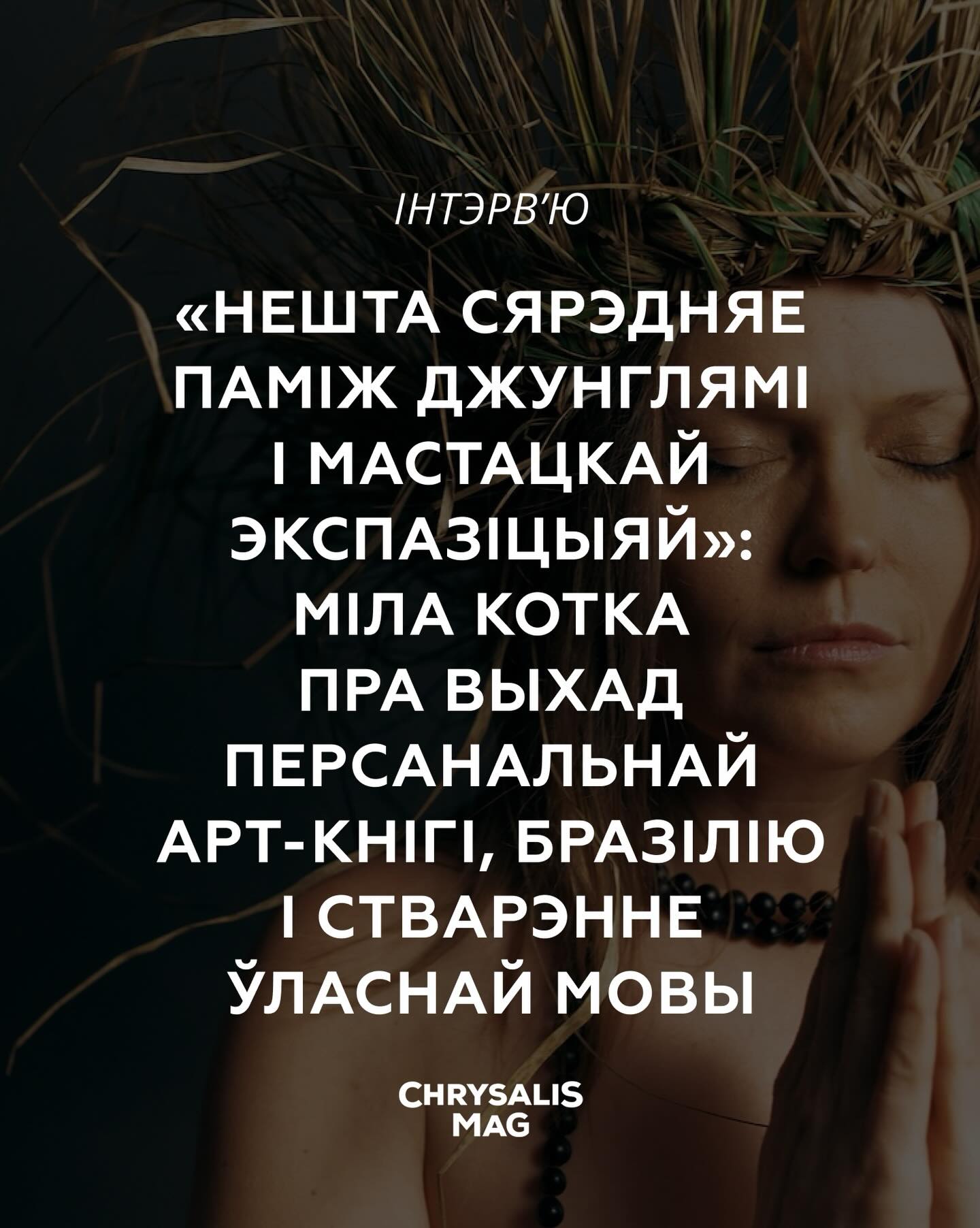
Instagram Layout 01
The logotype: a butterfly reads as both “chrysalis” (transformation) and an open book – the magazine’s mission in one mark.
Instagram Layout 02
The logotype: a butterfly reads as both “chrysalis” (transformation) and an open book – the magazine’s mission in one mark.
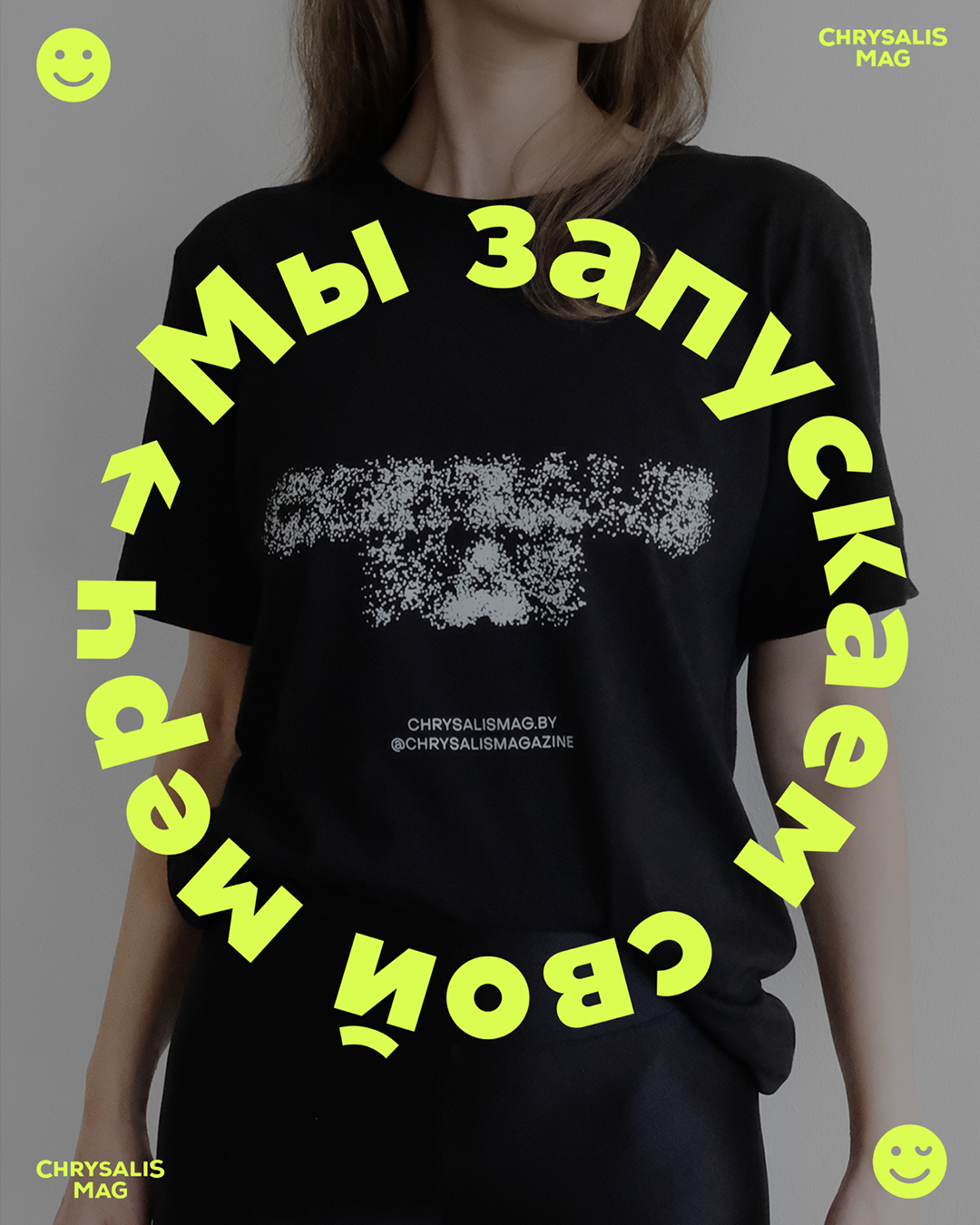
Merch Drop Instagram Layout
The logotype: a butterfly reads as both “chrysalis” (transformation) and an open book – the magazine’s mission in one mark.
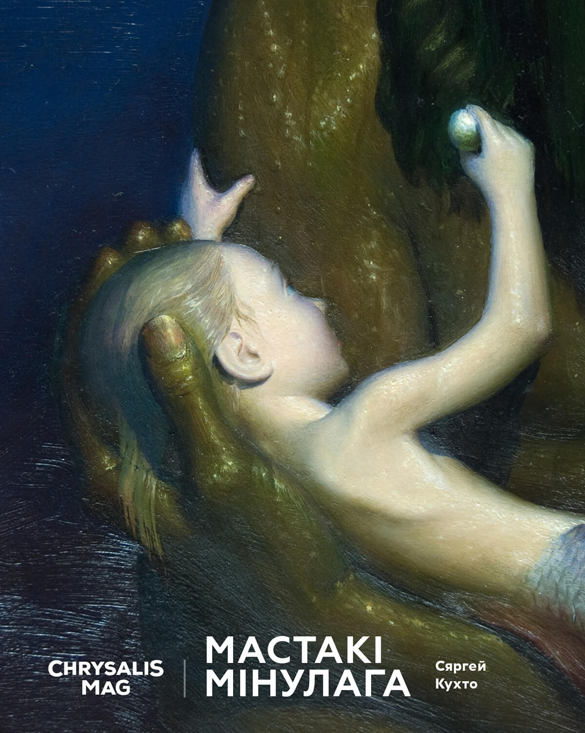
Instagram Layout 03
The logotype: a butterfly reads as both “chrysalis” (transformation) and an open book – the magazine’s mission in one mark.
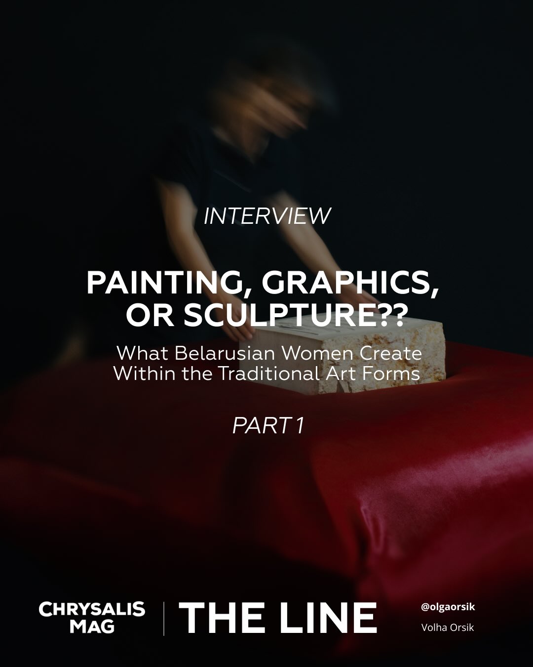
Instagram Layout 04
The logotype: a butterfly reads as both “chrysalis” (transformation) and an open book – the magazine’s mission in one mark.
07. Motion & Interaction
07. Motion & Interaction
Curated, not templated
Curated, not templated
Interactive: a reconstruction of the cursor-reactive mosaic experiment, rebuilt in ~40 lines of canvas code for this case study.
I designed the platform's interaction layer – hover states, scroll behavior, transitions, and micro-interactions that make it feel like a curated gallery, not a CMS with a theme. I also prototyped creative-code experiments like the Active Cursor Field, a cursor-reactive mosaic (live reconstruction on the right – move your cursor across it). Principles: feedback within 100ms, motion always describes spatial logic, and animation never delays reading.
I designed the platform's interaction layer – hover states, scroll behavior, transitions, and micro-interactions that make it feel like a curated gallery, not a CMS with a theme. I also prototyped creative-code experiments like the Active Cursor Field, a cursor-reactive mosaic (live reconstruction on the right – move your cursor across it). Principles: feedback within 100ms, motion always describes spatial logic, and animation never delays reading.
I designed the platform’s interaction layer – hover states, scroll behavior, transitions, and micro-interactions that make the platform feel like a gallery with a curator’s hand rather than a CMS with a theme.
Beyond the system patterns, I prototyped interactive experiments with creative code – like an Active Cursor Field, a cursor-reactive mosaic. A live reconstruction of the idea is on the right: move your cursor across it.
Interaction principles: feedback within 100ms, motion always describes spatial logic (where content came from, where it goes), and animation never delays reading.
08. Shipping with Engineers
08. Shipping with Engineers
Specs engineers can actually build from
Specs engineers can
actually build from
The site runs on WordPress (Semplice base) with custom-coded modules built in partnership with front-end engineers. My job was to make the build path unambiguous: high-fidelity specs and prototypes in, verified quality out.
The site runs on WordPress (Semplice base) with custom-coded modules built in partnership with front-end engineers. My job was to make the build path unambiguous: high-fidelity specs and prototypes in, verified quality out.

Engineering workflow. Designing with the CMS’s constraints – not against them – is why custom modules stayed maintainable for six years.
What I learned
To write specs engineers can build from directly: exact behaviors, states, and breakpoints – not just pictures of the happy path.
What I learned
To write specs engineers can build from directly: exact behaviors, states, and breakpoints – not just pictures of the happy path.
Constraint as material
Semplice’s grid and WordPress’s content model shaped component boundaries. Designing to the platform made every module cheaper to build and easier to maintain.
Constraint as material
Semplice’s grid and WordPress’s content model shaped component boundaries. Designing to the platform made every module cheaper to build and easier to maintain.
Knowledge sharing
After each launch: a short retrospective and documentation pass, so decisions outlive the project – and the designer.
Knowledge sharing
After each launch: a short retrospective and documentation pass, so decisions outlive the project – and the designer.
09. Special Projects
09. Special Projects
The platform became infrastructure others build on
The platform became infrastructure
others build on
Special projects are where the system proves its range: campaign-like work on deadline, for external institutional partners – each one shipped on the platform, each one feeding new patterns back into the system.
Special projects are where the system proves its range: campaign-like work on deadline, for external institutional partners – each one shipped on the platform, each one feeding new patterns back into the system.
Special projects are where the system proves its range: campaign-like work on deadline, for external institutional partners – each one shipped on the platform, each one feeding new patterns back into the system.
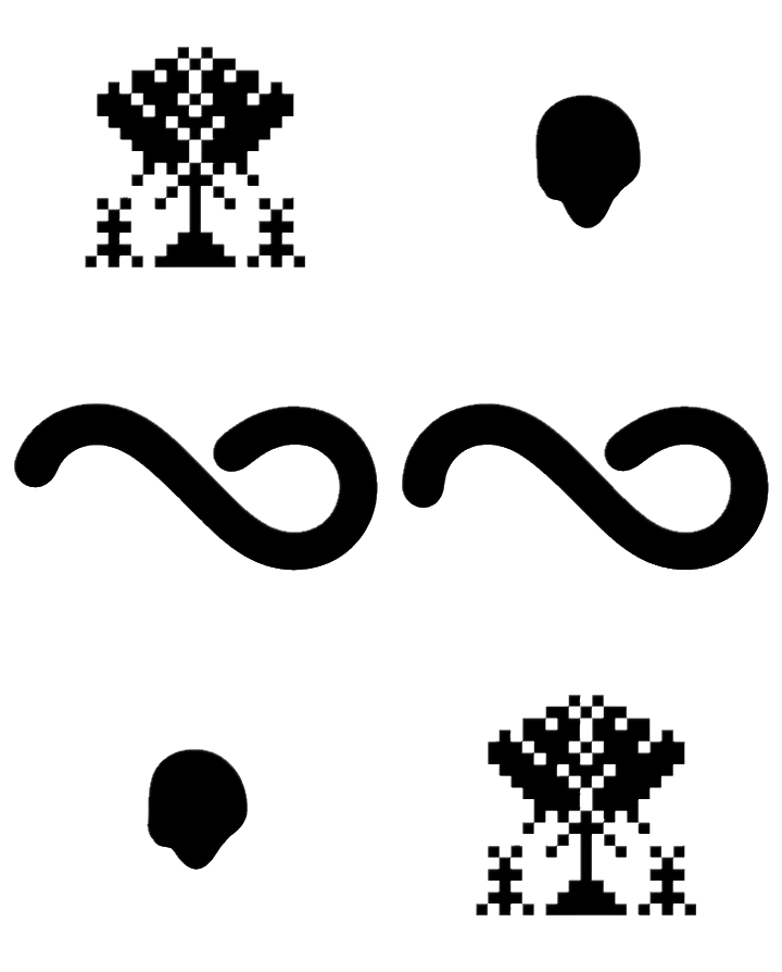
Codes of Heritage
Interactive stereogram generator built on Belarusian ornamental symbolism – concept, visual system, interaction design, Al-assisted build. Deep dive below.
Codes of Heritage
Interactive stereogram generator built onBelarusian ornamental symbolism — concept, visual system, interaction design, Al-assisted build. Deep dive below.
Codes of Heritage
Interactive stereogram generator built onBelarusian ornamental symbolism – concept, visual system, interaction design, Al-assisted build. Deep dive below.
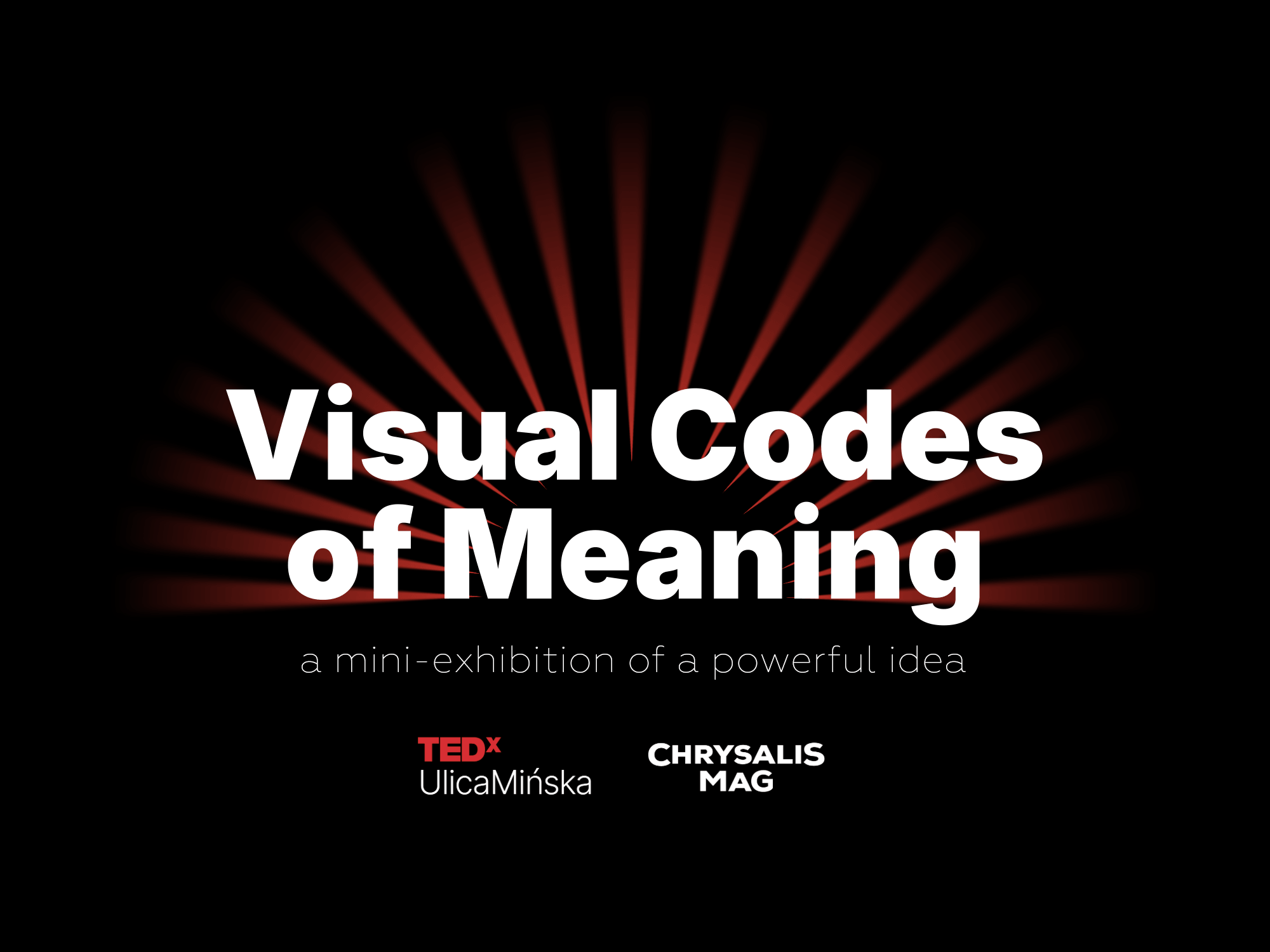
Visual Codes of Meaning • TED×UlicaMinska
A curated digital mini-exhibition produced for a TED event in Warsaw (2026) – artwork presentation, editorial layout, and the digital experience connecting exhibition to event.
Visual Codes of Meaning • TED×UlicaMinska
A curated digital mini-exhibition produced for a TED event in Warsaw (2026) — artwork presentation, editorial layout, and the digital experience connecting exhibition to event.
Visual Codes of Meaning • TED×UlicaMinska
A curated digital mini-exhibition produced for a TED event in Warsaw (2026) – artwork presentation, editorial layout, and the digital experience connecting exhibition to event.
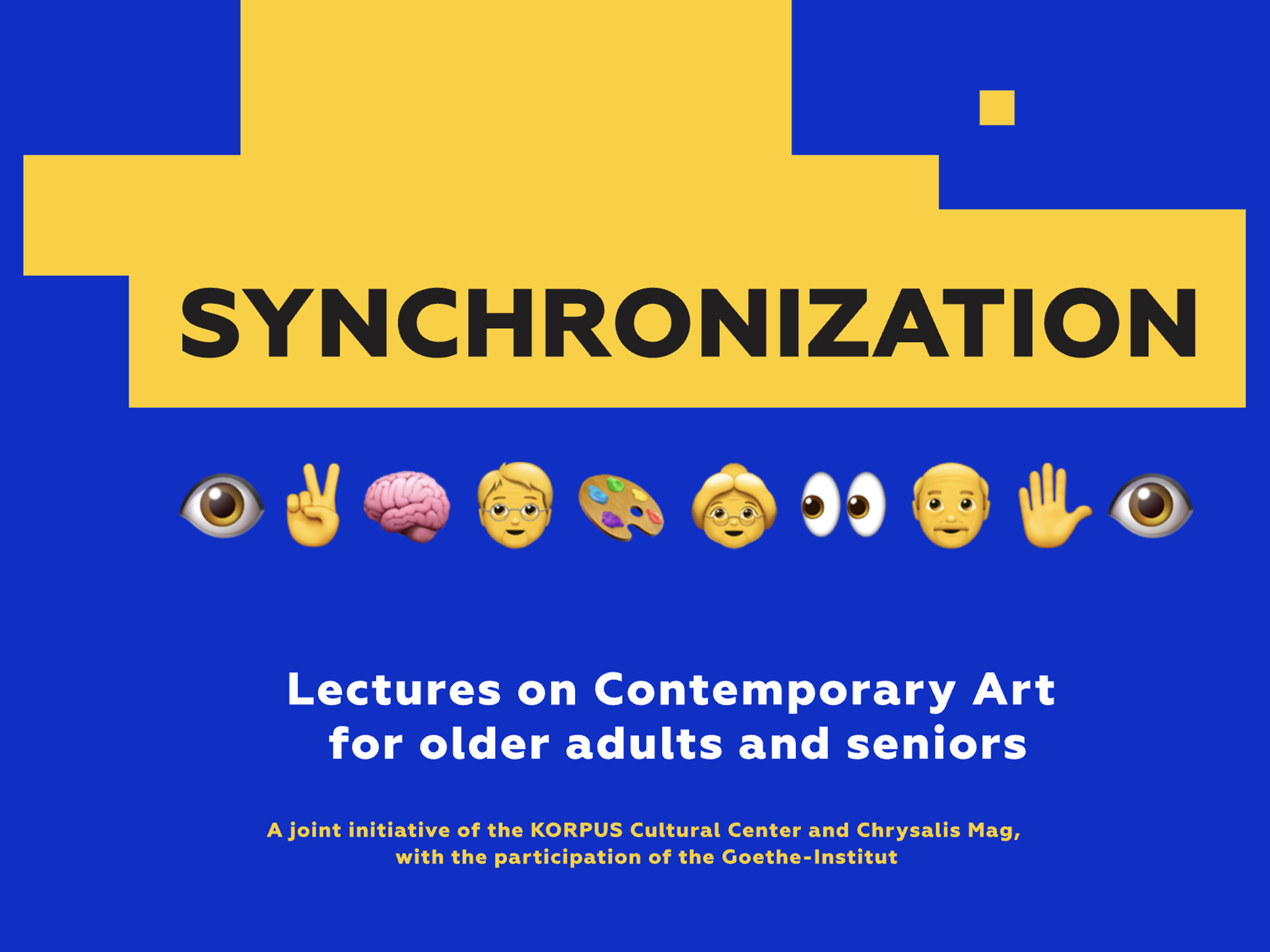
Synchronization • Goethe-Institut
Special project identity and digital experience – a bespoke visual system deployed within the platform's special-project shell.
Synchronization • Goethe-Institut
Special project identity and digital experience – a bespoke visual system deployed within the platform's special-project shell.
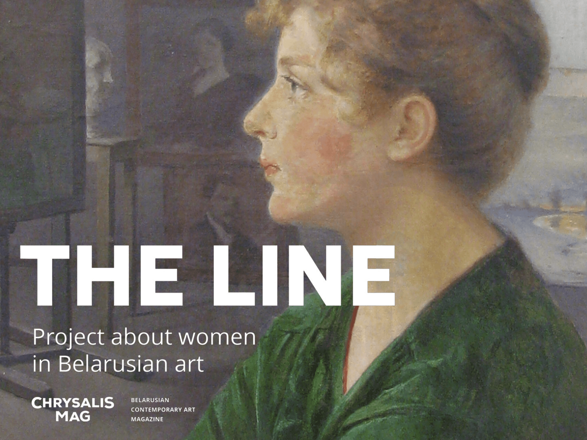
The Line
Editorial special project – a bespoke shell on the platform's system, with custom art direction inside the standard component logic.
The Line
Editorial special project – a bespoke shell on the platform's system, with custom art direction inside the standard component logic.
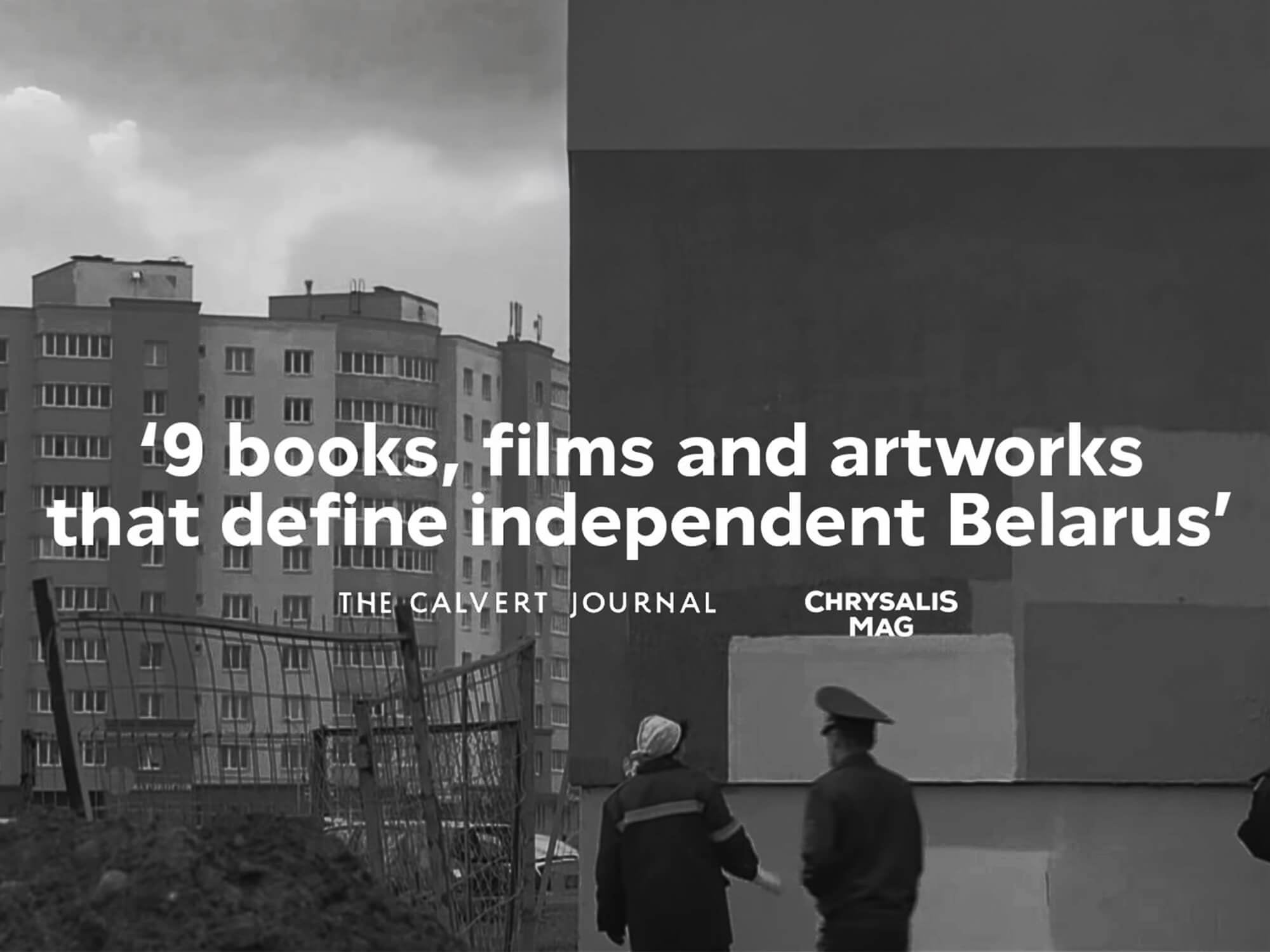
Partner collaborations
Co-productions with The Calvert Journal and 34 mag – the platform's editorial and visual system extended to partner formats.
Read Material for The Calvert Journal • New East Digital Archive
Partner collaborations
Co-productions with The Calvert Journal and 34 mag – the platform's editorial and visual system extended to partner formats.
Read Material for The Calvert Journal • New East Digital Archive

CHRYSALIS MAG + ZERNO EXHIBITION PROJECT
CHRYSALIS MAG + ZERNO EXHIBITION PROJECT
Zerno • Digital Gallery
An online exhibition format: gallery UX, artwork presentation templates, and a responsive viewing experience for a Chrysalis × Zerno exhibition project.
Zerno • Digital Gallery
An online exhibition format: gallery UX, artwork presentation templates, and a responsive viewing experience for a Chrysalis × Zerno exhibition project.
Also on the platform’s system
Synchronization • Goethe-Institut – digital learning platform. Designed end to end for a major cultural institution: UX/UI, visual identity, and design system for an educational experience balancing usability, dense content, and visual clarity.
Also on the platform’s system
Synchronization • Goethe-Institut – digital learning platform. Designed end to end for a major cultural institution: UX/UI, visual identity, and design system for an educational experience balancing usability, dense content, and visual clarity.
Why specials matter
Each special project is effectively a brand campaign shipped on product infrastructure – bespoke enough to feel like an event, systematic enough to launch on deadline. After each one, a retrospective decides what the platform absorbs.
Why specials matter
Each special project is effectively a brand campaign shipped on product infrastructure – bespoke enough to feel like an event, systematic enough to launch on deadline. After each one, a retrospective decides what the platform absorbs.
Outcomes
Outcomes
The system scaled past its maker
The system scaled
past its maker
Longevity
Longevity
A live, multilingual platform running for 6+ years on one coherent design system – evolved continuously, never rebuilt.
A live, multilingual platform running for 6+ years on one coherent design system – evolved continuously, never rebuilt.
Independence
Independence
Editors publish daily with zero designer dependency. That is the test of a real design system – and this one passed it for six years.
Editors publish daily with zero designer dependency. That is the test of a real design system – and this one passed it for six years.
Institutional trust
Institutional trust
Shipped special projects for external partners – Goethe-Institut, TEDx, Zerno, University of California in Los Angeles (UCLA), The Calvert Journal. Some of the project materials have been included in the web registry of the Ivy Plus Libraries Confederation. The platform became infrastructure other organizations build on.
Shipped special projects for external partners – Goethe-Institut, TEDx, Zerno, University of California in Los Angeles (UCLA), The Calvert Journal. Some of the project materials have been included in the web registry of the Ivy Plus Libraries Confederation. The platform became infrastructure other organizations build on.
Reach
Reach
The system extends across the magazine’s social presence – Instagram, TikTok, Telegram, Facebook, and YouTube – with a recognizable visual identity in every clip and cover.
The system extends across the magazine’s social presence – Instagram, TikTok, Telegram, Facebook, and YouTube – with a recognizable visual identity in every clip and cover.
Innovation
Innovation
Codes of Heritage: a shipped interactive product proving the same design ownership works for new mechanics and AI-assisted creation – not just editorial layouts.
Codes of Heritage: a shipped interactive product proving the same design ownership works for new mechanics and AI-assisted creation – not just editorial layouts.
What I’d tell my 2020 self
What I’d tell my 2020 self
What I’d tell my 2020 self
What I’d tell my 2020 self
What I’d tell my 2020 self
Learning 01
Design the editor’s flow with the same care as the reader’s. The people who use your system daily are users too – and they decide whether it survives.
Learning 01
Design the editor’s flow with the same care as the reader’s. The people who use your system daily are users too – and they decide whether it survives.
Learning 02
Constraints are leverage. Designing inside the CMS’s reality made every component buildable, maintainable, and cheap to evolve – for six years.
Learning 02
Constraints are leverage. Designing inside the CMS’s reality made every component buildable, maintainable, and cheap to evolve – for six years.
Learning 03
Document as you decide, not after. The system rules written in year one are why year six needs no archaeology.
Learning 03
Document as you decide, not after. The system rules written in year one are why year six needs no archaeology.
Chrysalis is an entire product organization’s worth of design decisions, held by one person, for six years: a style guide others build on, user flows and high-fidelity UI, campaign-like specials on deadline, workshops with cross-functional teams, and shipping with front-end engineers – plus documentation so the work outlives me.
Chrysalis is an entire product organization’s worth of design decisions, held by one person, for six years: a style guide others build on, user flows and high-fidelity UI, campaign-like specials on deadline, workshops with cross-functional teams, and shipping with front-end engineers – plus documentation so the work outlives me.
Chrysalis is an entire product organization’s worth of design decisions, held by one person, for six years: a style guide others build on, user flows and high-fidelity UI, campaign-like specials on deadline, workshops with cross-functional teams, and shipping with front-end engineers – plus documentation so the work outlives me.